SPORTS LOGO DESIGN, BOOKIE CLUB
Deportece
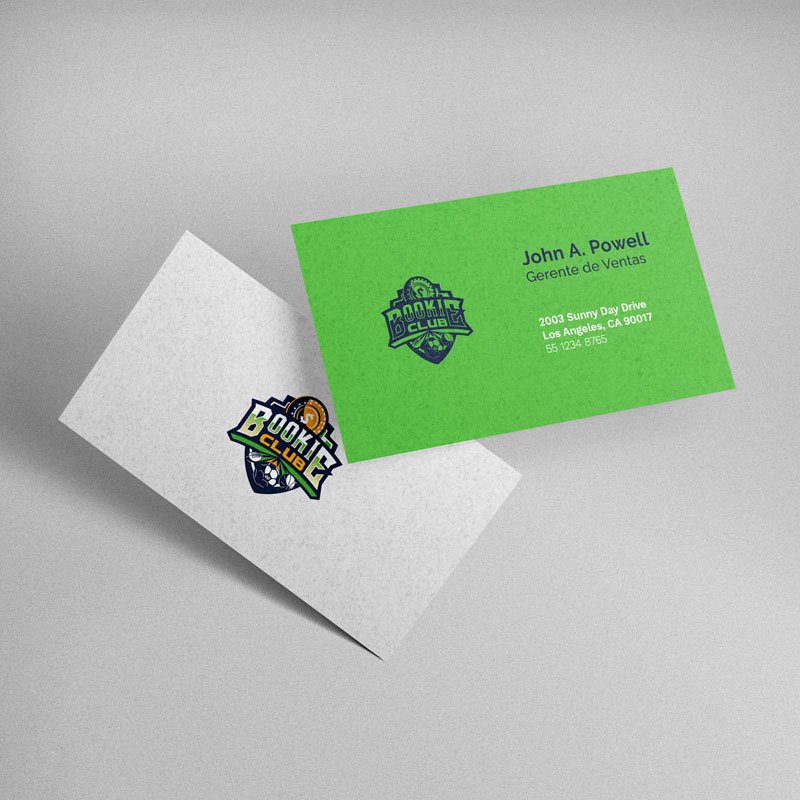
Sports logo design, for Deportrece’s “Bookie Club” betting service
The identity project aimed at designing the sports logo for Bookie Club, a sub-company of DeporTrece. Such branding would seek to establish the communication and visual identity of the betting service established by the company, in consideration of its target market.
The general concept is born from the identification of the images of its competitors, who opt for simpler images, composed mainly of letters. Therefore, it was proposed to use a more visually attractive image, reminiscent of tournaments, sports teams and the feeling of victory associated with it, with a fresh and modern approach.
The isologo, has as protagonists the text of “Bookie Club” itself, with a mixture of typographies that are dynamically related through a false curvilinear and isometric perspective.
Above them are accompanied by a sloping golden coin, which represents economic wealth and refers to a piggy bank. While underneath, 3 iconic sports balls “leak” from the composition, bringing dynamism to the isologo. All framed in a shield, which projects security and strength, like the Bookie Club service.
My participation in the project was the design of the sports logo and the development of the visual identity manual, as well as graphic materials such as profile images and digital banners, according to the client’s brief.
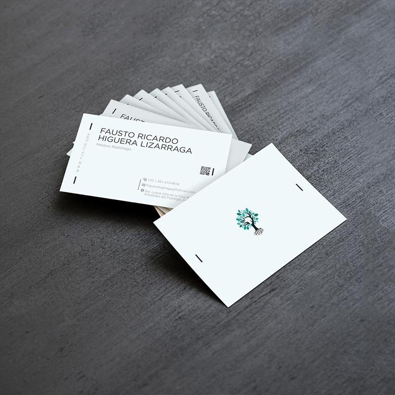
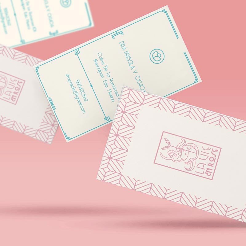
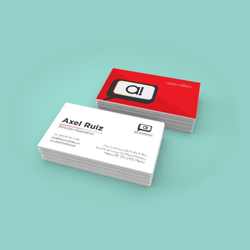
We recognize it!, developing a Personal Brand implies, in a way, playing a character. But it is possibly the most difficult of all, yours. Therefore, do not waste your time anymore and leave fears aside. With our advice on Branding and Brand Design, we help you meet your goals and make the future you want, reality. Contact us!